Just to be clear, I’m not talking about interacting with the slides themselves (that’s a different blog). I’m talking about interacting with your audience when your presentation uses slides. After all, one of the big things that Prezi claims is that it allows you to jump around your presentation in a non-linear way, making for a better audience experience.
PowerPoint and Keynote have been able to do that for as long as I can remember, to be honest, so I’m not sure how much of a genuine claim it is, but it certainly sounds like a great way to make better presentations.
What brings this to mind right now? I’m doing some presentations training next week for students in Spain and one of the things I’m innovating to the way it’s usually done is to give a point in the second day when participants can decide what they want to do next.
We’ve called that part “This, that, or the other” 🙂
As an aside, Prezi cites “double-blind” research into Prezi vs Powerpoint but how the presenter & audience can’t tell which software is which when they’re delivering/in the presentation is absolutely beyond me.
The beauty of this approach is that it gives your audience more input to the presentation and makes them feel far more engaged. The obvious downside is that I have to have three different sections of my presentation prepared. Never mind, I’ll re-use the presentation and it’ll all come out fair in the end. If it doesn’t, and my audiences only ever selects one particular option… well that tells me something important about what’s important to audiences and how to make my future presentations better.
The basic and brutal approach
Calling it basic and brutal is harsh, but you’ll see why when you read the other tips below. Even using the sledgehammer approach can make your presentations nicely interactive… and it couldn’t be more simple!
When you’re delivering your presentation, simply type the number of the side you want to jump to and then hit the ‘Return’ key. Simple as that. You’ll be jumped to that slide.
The bad news is that you’ll jumped to that slide, so any fades, animations or clever transitions just don’t happen. It’s ugly but it’s effective.
A pro tip is to have plenty of black slides scattered around your presentation. (It’s good practice anyway for a number of reasons.) That way, you might be able to jump from one black slide to another one – the fact it’s a jump and not a fade, won’t matter.

A slightly more subtle way of doing it is to use “PresenterView“. That’s when you set up your laptop so that it shows something different to you compared to your audience. They see the slide but you see (for example) the slide, the next slide and your notes… And one of the things you can set up to show is the set of ‘thumbnails’ of your slides. Just by clicking on them you can jump to that slide.
The upside of this is that you don’t have to remember the slide numbers involved, which might be a bonus in the pressure of your presentation. The downside is that it takes a bit of setting up and it’s a bit of a fuss.
Here’s how I’m doing it in my presentations

At the appropriate point in the presentation, there’s this slide. (It’s only draft as I write this blog, so don’t judge too harshly, but it works enough to give the impression.) Each of the fake “post it notes” is a topic that my audience can picket go next.
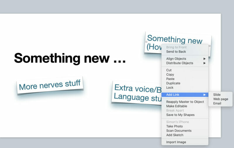
By the way you’ might recognise this as basically a bullet point list, just made to look more interesting! There’s more about how to replace bullet point slides in your presentation here. Once the slide looks right it’s a simple job to make each image a hotlink. In PowerPoint you can do it like this and in Apple’s Keynote you do it like the image below. Just right click on the object in your slide (in this case a text box) and Bob’s your uncle.
What’s even cooler, when you do this it keeps the slide transitions that you’ve got in place when/if it jumps over slides to get to where your hyperlink is aimed at.

It looks so damned sexy it almost hurts :). The result is that when I show the slide above, no matter which of the options my audience picks all I have to do is click on the appropriate text box and the appropriate slides magically open up.

Pro tip. I’m using the magic move transition, and I’ve copied each text box to the ‘next’ slide, in a different place, and bigger, so that it moves and grows, and works as a title on the ‘next’ slide. (Yeah, the body-language slide has some cool-looking stuff in it, too, I know 🙂 )
So what could go wrong when you use this in a presentation?

Not seeing the mouse is my favourite mistake!
I tend to turn off my cursor when I’m presenting, so that I don’t accidentally show it on the screen – which looks a bit amateur – but it does make this a bit tricky! If you can’t see where your mouse is, you can’t see where to click. I’m not going to go into the details here, because pretty much each piece of hardware and software (and combinations thereof!) deals with hiding/showing your cursor in different ways… but you get the idea. Just check that your cursor shows on the screen when you fire up your slides!

It’s a bit complicated
There’s nothing special about this I’m afraid, but there’s no denying that if your slide can link to multiple places in the slide deck it can get a bit messy to make sure that your links go to the right place. It’s particularly tricky if the slides looks similar. (The voice of experience!) the way around this (also from experience) is to:
- finish designing your presentation’s slides are finished before you start. Yes, the software will update the links if you add/delete slides, but it’s much easier to keep your head straight if it’s all done and dusted before you start
- work in some layout (whatever that is for your software) that shows the slides as well as the slide you’re editing at the time, so you can see the numbers of the slides easily. By all means print them out if you want to but I’ve found that this isn’t necessary, and frankly makes mistakes more likely as you change slides but forget to re-print everything.

Just check it, will you?
I shouldn’t have to include this one, I know, but I do. Why? Because just because it works on your set up doesn’t 100% guarantee it on someone else’s. This ability has been around for so long now there’s no excuse of it not working at the venue, but you’ve heard of sod’s law, right?
So how do I use this when I’m delivering the presentation?
The big advantage is that it makes your audience more in control and makes them feel more in control. They’re more invested – so use that. Make a big thing of it. Tell them the choice is coming up and that they should be thinking about what it’s going to be.
That’s especially effective if you have a presentation where you do something topics A, B and C, and each time you shift topic you flag up the fact that you can go into detail about one of those things later on, so they (your audience) should be keeping score of what’s important. It builds the hype and it gets people to concentrate harder/engage more. 😉

By the way, that increase the chance of your audience taking on board what you’re saying at giving you a Third Order impact for your presentation – you can read about that here.
In terms of how you decide which one to do… it rather depends on you. I’ve done it by show of hands, for example, when I’ve simply asked my audience to show which options is more important… for some audiences you could get them to say something or even shout and make your decision by volume! (I don’t recommend that for presenting to the board of your company but it’s a lot of fun in other circumstances!)
On the other hand, you could just pick someone from the audience… the boss perhaps, or the person the audience has nominated… or even the oldest/youngest/wisest/most longstanding member of the audience.
If you go for this sort of approach you’ll get a lot of conversation afterwards too, about why would have happened if someone else had chosen! Of course, if you put a hyperlink at the end of your selected section you can go back to your original choice slide, and go somewhere different this time!
(Just don’t forget to put a hyperlink in to jump out of the loop somewhere! 🙂 )
And what about your presentations?
I love this tool for increasing how much I interact with my audience – but what about you? Have you seen it done? (Of course, you might well have seen it done so well you didn’t notice! 🙂 ) Can you think of times when you could use it? If not, what’s wrong with you?!? 🙂

I had absolutly no idea you could do this in powerpoint, what a fantastic find, thank you, i can see exactly how this keeps the audience engaged and excited about the presentaqtion and more to the point feel really involved.
I assume this would work on a live webinar also if it was on a screen share type platform rather than load the slides into a webinar platform?
Great post
Thanks Simon
Yup – in Powerpoint it’s hidden in the “insert” menu but the idea is the same… and yes, it works beautifully online. (The magic is in your slide deck not in the broadcast software.)
Have you tried to create a Zoom in PowerPoint? It creates a slide with images of other slides that you can navigate to.
Yup – didn’t like the level of “fuss” involved in doing it, personally, but the important thing for me is the idea, not which software does it.
I find hyperlinking to be more flexible and less fuss – but you’re right that PPT’s Zoom function does it really well. (Is there a post on your site that shows how to do it I can link to?)
Pingback:Presentation lessons from my holiday – honestly! – Better Presentation Skills