
I’ve been working in more cities than there are days in the week recently. I’ve seen more training rooms than friends 🙂 (Fortunately that’s changed this week in case you cared! 🙂 ). That got me thinking however, about how the different rooms affect presentations.
Room layout: Example 1

Let’s start north of the border with this bunker-like monstrosity! 😉 The caption kind of gives it away, to be honest. The expectation was that I’d sit at the table with my slides appearing on the wall behind me. My concerns were that this created a very clear barrier between me and the audience and (because I was sitting down) it sucked the energy out of what was going to happen. Fortunately it’s not hard to shuffle things like that around, and ten minutes later it looked a bit different.
I moved the table out of the way, turning it 90 degrees as I pushed it to the wall. That way I not only got it out of the way, I had:
- got somewhere to put my laptop so that I can see my slides as I present, without looking over my shoulder at the big display;
- create a big space for me to stand/perform in; and
- removed the psychological barrier between me and the audience.
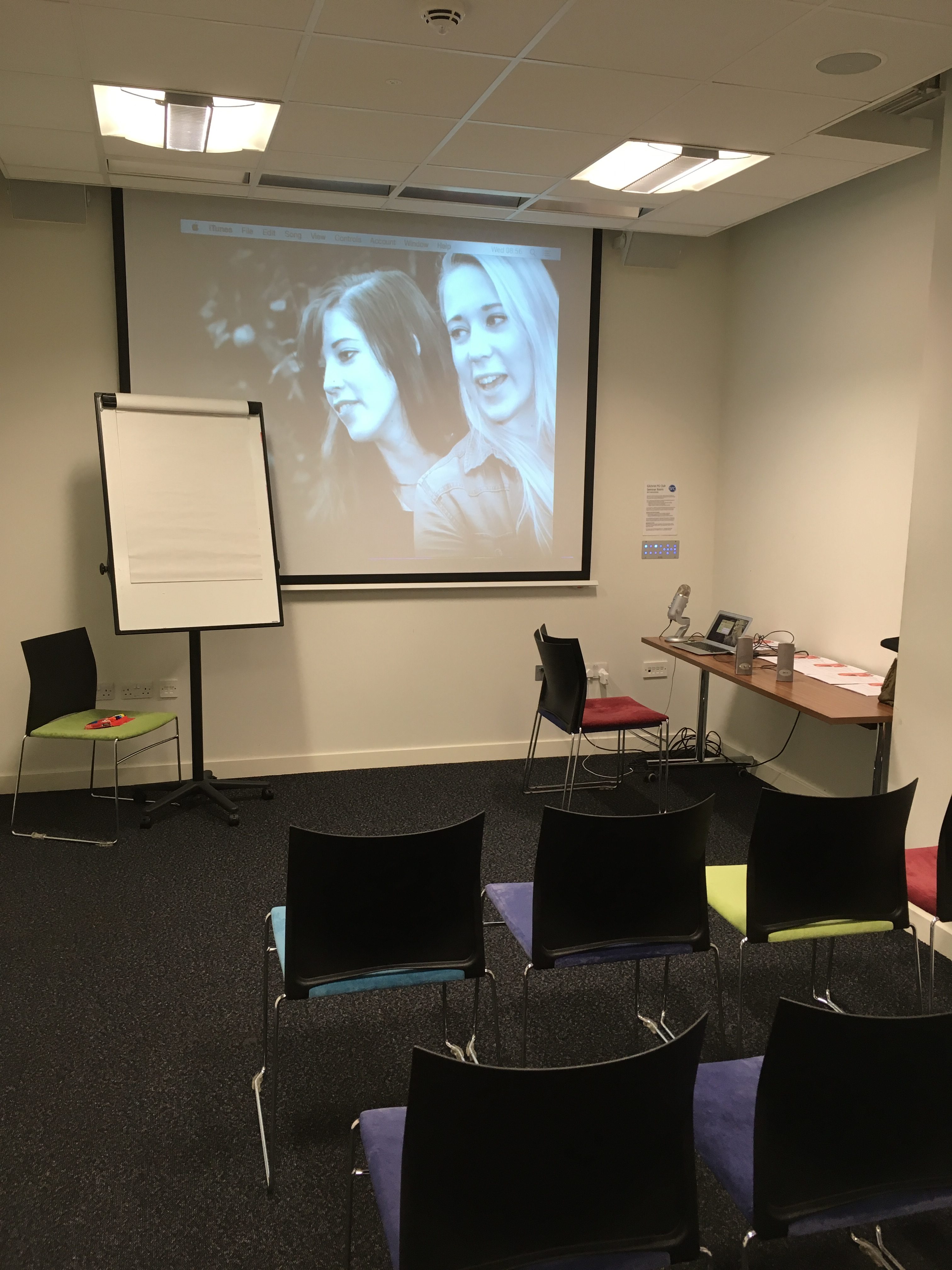
All I had to do at this point was move the flip chart to the side of the screen and sort out the last two random chairs at the front.
Note the picture on the screen. I always use that one. I know exactly what it should look like, so it’s a great tester for the set up. As you can see, it didn’t quite fill the screen, so I needed to spend a few minutes looking at the zoom (and then the focus) of the projector to have things as big as they could be.
After that, job done and I was ready. It took about 15 minutes in all, but was very much worthwhile from the audience’s perspective.
(By the way, the pic is of my daughters. I don’t just use it as a set-up image, it’s a great way to stay rooted when I’m not able to get home, but that’s just a personal thing… 😉 )
The way the audience’s chairs were laid out gave a very specific feel to the room and the audience’s expectations, too. By putting them in ‘theatre’ layout it gave the immediate impression (as you entered at the back of a long, thin room) of row after row of the backs of seats. Not only is that an uninviting first impression, visually, it also sets up in people’s heads the idea that they’re there to be (passive) receivers of stuff from the front.
Different layouts such as a horseshoe have a more ‘interactive’ feel.
Room layout: Example 2
 Moving a bit south of my home base a day later, and this is the room layout. It’s a lot neater, and laid out as a horseshoe , but look how narrow it is!
Firstly that starts to feel to people that they’re in some kind of competition, staring down the opposition team on the other side of the room… but just as importantly, it left no room for me to get in and mix in with the participants. I had no choice but to deliver from the front. At least this room had space for me to do that (and natural daylight, thank heavens!) but as people weren’t facing me, twisted necks were bit of a problem!
Ten minutes of sweating later and things are a lot better as I’d moved things about six feet apart by putting a table’s depth between them. I’m not claiming this is rocket science, just that it’s not something that unconfident presenters often think of, as all too often nerves get the better of them and they take what they’re given.
Your room layout might not be as fixed as you think! If there’s a better way to do what your presentation is supposed to do, don’t be afraid to get sweaty!
Room layout: Example 3
 Of course, some times you can’t do a darn thing – the chairs are bolted to the floor and the projectors are fixed to the ceiling. Still, at least there’s plenty of punch in the projectors and the fact that there are two of them here makes it easier for the audience to see!
Some venues are just an absolute joy!
