Nexus is the organisation that runs the local Metro transport system near me. Before we go any further I should add that I love the Metro and use it whenever I’ve got the option.
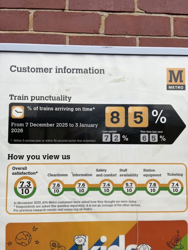
One of the things they do that I like is to present Metro reliability information pretty publicly — and kudos to them for that. The problem from the users’ perspective is that they present their information from their perspective. Here’s an image of some of their recent information, taken at my local station.
85% of trains ran to time but there are three problems with this. The obvious one is that that’s not a high enough number. The second is their rather liberal definition of “on time”… but the third is more insidious.
Spotted it?
I’m going to be impressed if you have ‘cos it’s one of the biggest problems with presentations, too — it to do with how we think/act compared to how our audiences need us to think/act.
The problem with the “15% of trains that didn’t run on time” is that there’s an additional, separate figure for the “percentage of trains that didn’t run at all”. (I know this is true, I asked them!) Obviously from Nexus’ point of view that makes sense because you can’t measure how late a train is if it’s not there. It doesn’t make sense from the users’ point of view though, because as a user of the Metro, my feeling is that ‘not running’ is the absolute epitome of ‘running late’.
If it’s not there, it’s infinitely late as far as passengers are concerned.
The problem here is that the poster (and by extension Nexus) haven’t given thought to how people want/need to receive the information — what the information is being presented for, in a sense.
Data presentation rules!
I’m not going to talk about the technical elements of presenting data… things like which kind of graph to use and how not to sabotage the axis of your graphs. I’m talking right now the thinking that should precede that — but often doesn’t. They’re note rocket-science levels of difficultly! We just forget to ask them…
Question 1 — what’s the point of sharing the information? The follow up question of course is “What’s the best way to share it?”. It could be a graph (good!) or it could be an case-study-story (also good). Don’t just throw the data at people in the format it comes to you in. Sometimes you need to change the medium, not just the format!
Question 2 — what’s the context of the information? I’m going to put good money on the table here and say that a lot of what you share would make more sense to people if they just had once sentence of context. “I’ve decided not to see Dave any more” might leave your coffee-date-mates scrabbling for a minute or two, but if you started off with “Remember I was seeing someone at work but I wasn’t sure it was a good idea because we work together? Well, I’ve…”.
Question 3 — how are people going to use that data? In my Nexus example, people were going to use the data to decide how reliable the Metro system is. Some kind of overall reliability measure is needed! Add to the fact that some trains are (over-)packed and others are largely empty it makes sense to show those figures in terms of “journeys affected”, or something. Perhaps something like: “The percentage of journeys affected by late or missing trains this month is only 12“. It’s more user-friendly, too, as well as addressing the key issue of the poster.
Question 4 — is it idiot-proof? This is a tricky one, I know, because no matter how hard you try to keep your presentation crystal clear there’s always someone who’ll find a different way to interpret things, but at least try. A handy thought-experiment I’ve fun a few times is “If I was being paid to twist this for nefarious, perhaps political, reasons, what would I do?
An example of this I saw recently was a right wing Republican. They were desperate to discredit the Democrats who were, at the time, protesting the kidnapping of the President of Venezuela by the United States. As the Venezuelan President was (nominally) a communist this Republican pointed out that Democrats were protesting in defence of a communist and were therefore communists. For the record, the Democrats were protesting the unlawful way things had been done, not particularly who it’d been done to. By the way, if that choice of example offends you:
- whether they Republicans or the Democrats were right or not is not the point
- you’re part of the problem.
I’ve just seen someone (seriously!) posting that because the Democrats were up in arms (metaphorically) about the way things had been done, and the person these things were done to was (nominally) a communist, it revealed that Democrats in America were communists.
Clearly that’s political motivated tosh, with about as much logic as:
- all elephants are grey
- mice are grey
- therefore mice are elephants
… but the fact that someone could do that is the point. Ask yourself: how can I present my data in such a way that it cannot be mis-interpreted.
Question 5 — will the data move the conversation forward? Stick with me here. All too often I see data used defensively — that is, to do things like build credibility withe audience; sentences like “We’ve got 32 factories in 19 countries are the kind of boring background that should be shared before your presentation. That sort of thing should be in your bio (be careful) or in the introduction someone else gives for you before you start to speak. If you know the audience well enough to not need to be introduced, you also know the audience well enough not to need that kind of data!
Question 6 — does the data include the uncomfortable. Just because data tells the truth doesn’t mean it’s the whole truth. Intentional or not, selection bias is a real thing. Reporting that undocumented immigrants in the US had arrest rates of around 400 per 100k is bad. But don’t forget the rest of the information. Citizens of the US, using the same data, have arrest rates of well over twice that.
A handy trick I’ve used a lot is to ask myself: if I wanted to disagree with the implications of this data, what would I look for? …and then look for it, obviously.
Wrapping up — data presentation questions.
So that’s it. None of this are hard questions, really. We just forget that we need to ask them.
