Something I’ve noticed recently is that (despite people ignoring all the evidence and advice to design their presentations using PowerPoint instead of going non-digital) when it comes to the look of their actual slides they still think like it’s a piece of paper.

Paper only has two dimensions – along and up (or X and Y). You can give it a pseudo-3D by the way you draw in those two dimensions but that’s not what I mean. What I’m thinking of here is the real third dimension (Z) which dictates what objects on the slide appear in front of others.
A background picture, by definition, appears at the back, right? A text box should have a higher Z-score and be “on top of” the picture so you can see it. So far so bloody obvious.
(The fact that people often get the layering a little wrong is a topic for another day.)
I want to remind the world that there’s a fourth dimension — that is, that slides can change over time. We can fade stuff in and out. Yes, I know, it’s bloody obvious when I say it, but stay with me a moment…
Before you say anything, don’t worry, I’m not advocating for pointless animations. I hate those more than you do, trust me. What I am advocating for is the intelligent use of time-based changes. Consider this circumstance:
You’re explaining a complicated graph on your slide. Instead of throwing it all up there at once, do your content a favour and break it down
- ring on your axes (plural of axis, not the bladed thing for killing orcs!) and explain them
- when people understand what you’re measuring should you fade in the line of the graph
- if you’ve got two curves to show, think about bringing them in separately.
Your audience will understand things much better… and remember it more, too.
Or consider this (real) example of teaching medical students the anatomy of a knee. Knees are complicated things and even if you peel back the skin it doesn’t look like the inside of a wiring diagram — things aren’t neatly laid out and colour-coded. So here’s a process that uses slides to maximise how the presentation increases understanding and retention:
- Show a simplified diagrammatic version of a knee — coloured outlines or whatever you need to do to make it easy to “get”
- Bring labels in, one at a time, on top of the diagram and explain them individually as you do
- Keep the labels in place but fade out the diagram behind it and fade in a similarly scaled image of the real thing so that the labels now sit over what the the audience (medical students) are looking at, but now they know what they’re looking for
- Consider replacing the photo of the knee (the real one) with different knees, keeping the labels, so people get practice at seeing variation but spotting the pattern.
If you really want to be clear, when you fade in the real photo of the knee keep the diagram version superimposed on it before you fade the latter out, to really help people know what they’re looking at.
Or take this combo of slides that I literally cooked up by “selecting by colour” from the original diagram while on a coach ride across Ireland after a gig (which explains why my slide versions are so shoddy, but I did it to prove a point)…
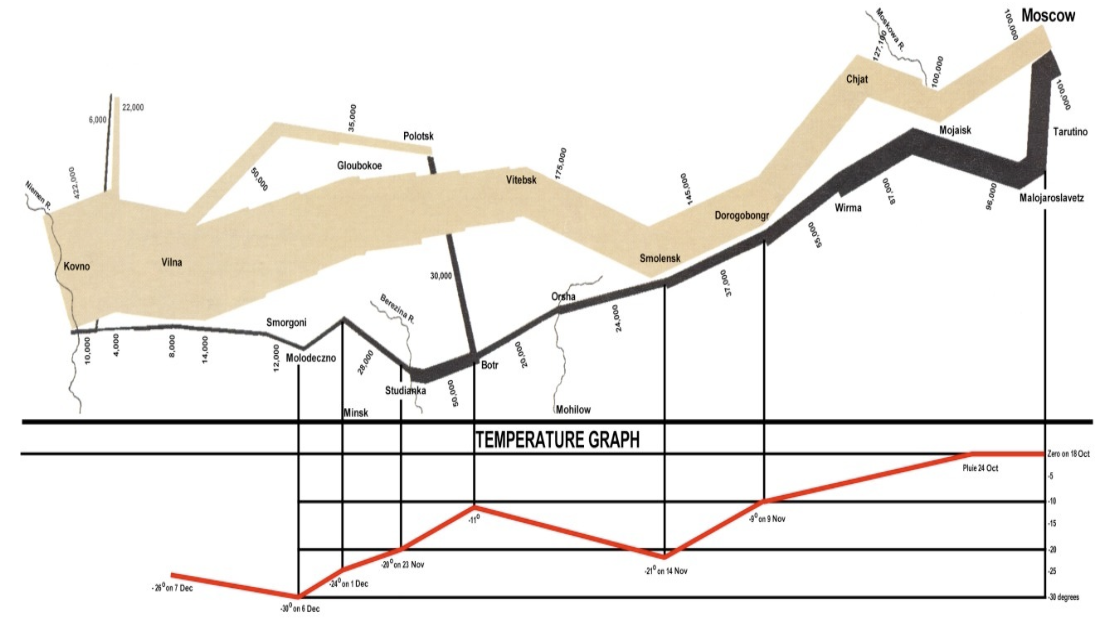
First the very famous image that needs explaining. If you’re like most people you blink twice when you see it 🙂 Even when I tell you it’s a map of Napoleon’s advance on, and retreat from Moscow in 1812 you’ll struggle to take it in.
But here’s now you could break it down to make it more understandable and memorable for an audience.
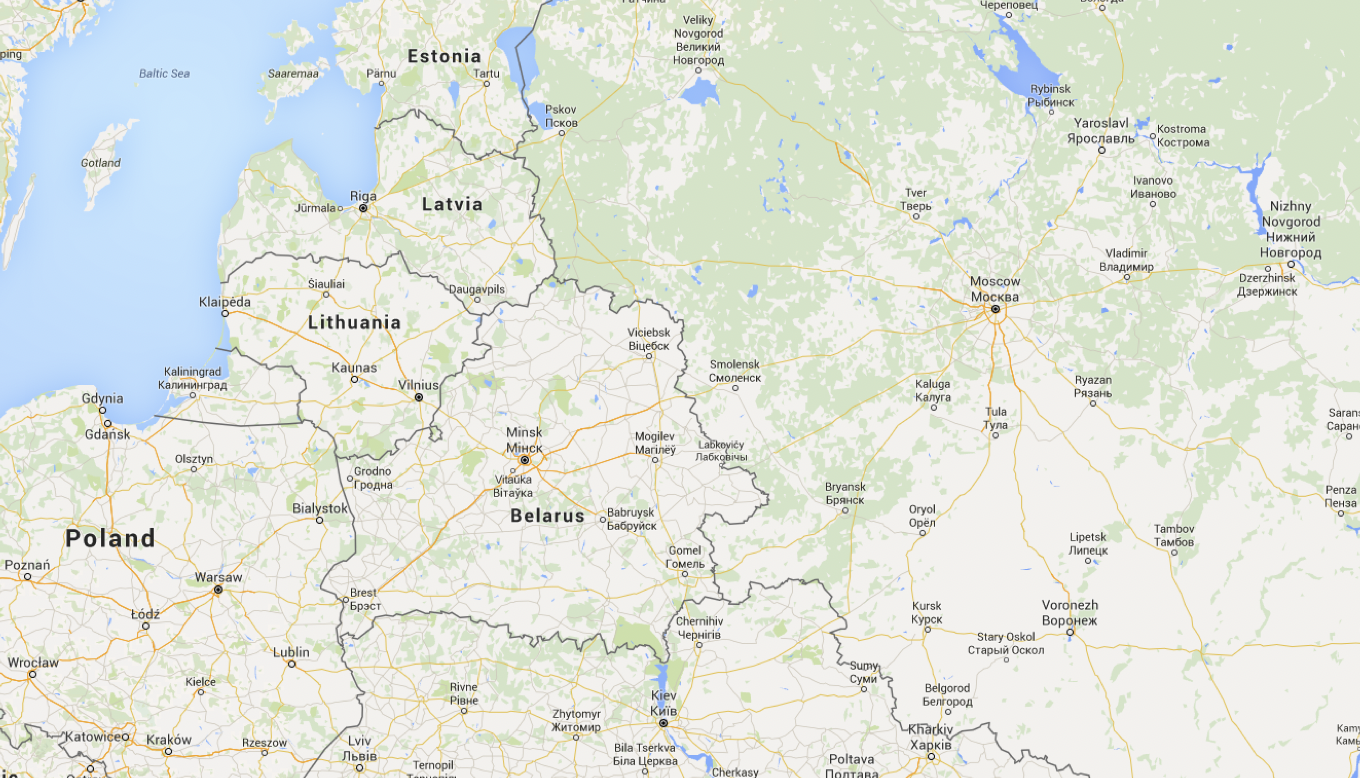
First, geographical background. Discuss where we are in Europe. Then zoom in and fade that map a bit so it’s just background info now that it’s set the context.
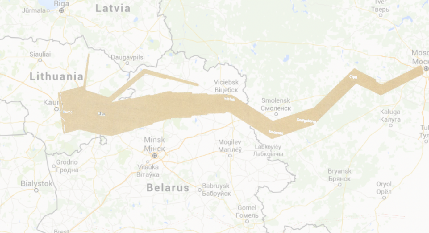
Then swipe-fade-in, left to right, the advance on Moscow. The thickness of the lines represents how many troops Napoleon had. You can see the attrition.
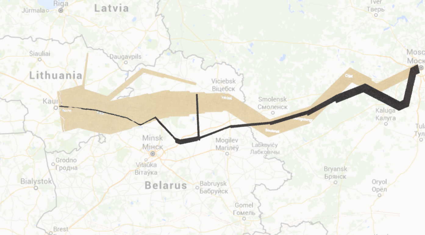
Finally, here’s his retreat. It’s not looking good for him. Again I wipe in the animation when I show the slide, this time from right to left (because that’s the direction he was going).
Sure, it takes a few slides rather than one, or one complicated slide with lots of animations, but your audience’s understanding goes up through the roof!
By the way, there’s a video version of the whole Napoleon thing here if you want it…
