

Cast your mind back to when you were at school. (Sorry!) Your teacher was almost certainly a dedicated, trained professional, specialising in how to get information into your head. With me so far? And yet despite that, your teacher didn’t just present information to you in a ‘once and done’ approach, right?
Nope: I’m betting they spent a long time doing things like:
- challenging you to make links
- doing revision
- explaining things repeatedly in different ways
- getting you to explain ideas to each other in your own words.
(They probably also privately had a drink in desperation but that’s a different story. 🙂 )
Long time readers will know I play the Djembe (you can hear me goofing off in the link below 😉 ) and currently I’m learning to play the Cajon and to speak Spanish. If a once-and-done-style of presenting information was all that was needed I’d be a Cajon diva by now and borderline fluent-like-a-native in Spanish. Trust me, I’m not.
I can see my Spanish teacher (hi Angeles!) trying not to wince at my accent, repeatedly, and how she doesn’t scream at me when I can’t remember how to conjugate a verb again I don’t know.
Brutally, getting ideas and information into people’s heads is more complicated and more difficult than once-and-done.
So, whats a poor presenter to do?
It’s tricky. It’s tricky because teachers have advantages that presenters don’t. For example, as a teacher you can reasonably expect your “audience” to:
- undertake homework between lessons
- do various activities during lessons
- be able to come back repeatedly not just sit through one presentation and go
- have access to supporting resources such as text books
- be motivated (not always, I admit)

You get the idea, I’m sure. Imagine asking your presentation audience to spend 20 minutes of your 50 minute presentation doing a word-search, or similar activity. That’s a great learning tool (for lots of people) but it won’t cut it in the board-room!
Let’s take look at what presenters can do to be a bit more like a teacher 😉
Presentation follow up

One of the best tools I’ve come across to help the presenter ‘be more teacher’ is to give people things to take away – physical props and reminders of the content of the presentation. It might be a “cheat sheet” with summaries on, or other prompts to memory. Workbooks are great here, because they not only work as memory aids after the presentation, if they’re well designed they work well during the presentation itself too, as people need to fill them in themselves. That makes them less likely to be totally passive during the presentation. Active, engaged brains are more likely to retain things.
Other things that might be handy are
- video access to your presentation (but see this post about presenters hating to see themselves in recordings!)
- screen recordings of technical stuff – particularly animations of complicated things
- slide handouts (but be careful here – see below!)
- anything else you can think of, depending on the topic of the presentation, frankly!
Here’s a note of caution. Good slides make bad handouts, so be careful what you give in your follow-up documents. Sadly, best practice is to do twice the work you want to – spend time designing the presentation itself and spend time designing a follow-up document. The abomination that tries to ride two horses is called a slidument. Think about it – image-based slides don’t carry enough information for people after the event, but text-based slides don’t work during the presentation itself.
You know this, you’ve been there!
Put in the work and create two different things!
Present like a trainer

There’s a blurred line between presenting and training but it’s a bit like an elephant – you know it when you see it. Trainers will take time out from delivering content to get their participants to do exercises which are designed to embed the content. The crapest (but easiest) is to say something “Turn to the person next to you and have a conversation about the last time you…”.
Done well, these exercises make your audience work harder, and learn more. (Done badly they just piss people off and act as padding/time wasters.)
As a presenter, there’s no absolute rule that says you can’t do a little bit of this. Don’t go overboard (it’s not training, it’s a presentation) but at least ask yourself the question… “How can I get my audience to do some work during my presentation?”. Simple examples I’ve seen in the past have included anything from asking for a show of hands (simple, quick, less impactful); to asking complicated questions (less simple, slower but more impactful); to doing a full-on activity where people were walking around the room with video cameras (complicated, messy, time-consuming but impactful).
No laptops in your presentation
It’s tempting to simply say “read my book” at this point. 😉 Presentation Genius has a chapter that reports quite a bit of research about note-taking. To save you the time (and the money, you’re welcome!) here’s the Readers’ Digest version:
- lots of people take notes on laptops with the justification that it gives them a strong record of the presentation that they can access later for revision
- the electronic record is uploaded to the cloud so that point one is possible pretty much anywhere
- but – frankly – how many of us ever actually go back to those presentation recordings? No, thought not!
- it’s very hard to concentrate on the content of the presentation and the technology/effort of typing notes etc so the latter trumps the former (otherwise there’s no point in trying to capture electronic notes of the presentation!)
- it’s more or less impossible to take analogue notes fast enough to create anything like verbatim notes
- the result of this is not that the notes are hole-filled; instead, what we do is adopt different note-taking methods such as flow diagrams; spidergrammes; bullet points; short quotes; different types and levels of emphasis; arrows connecting related points.
- the result of this type of note taking is that more of your head is involved and as a result, there’s a better level of understanding and recall

To illustrate the point, think about how quickly you can take the notes on the right when you scribble in your notebook. Now compare that to how relatively slowly you’d be able to make those notes in Microsoft Word. (I should recognise, of course, that the advent of stylus-based notepads might resolve this problem and give the best of both worlds but there isn’t any research I’ve been able to find about this yet.)
All of this, of course, is on top of the obvious advantage of audiences using notebooks, not laptops – you can’t be distracted by facebook on a notebook.
So far so good – we’ve looked at different ways of handling the way you deliver the presentation, but what about how you design the presentation?
Designing a presentation to make it stick
The obvious starting point here is not to give people more than they can handle. Your teacher didn’t give you the full history of your country in one lesson, did they? Nope. They cut it down into bite-sized chunks that fitted into how long your lessons were. And before you make the comment “But I still didn’t learn anything” think about what that says about you! 😉 I, for example, learned pretty much nothing in French lessons no matter how little content there was – but everyone else could cope, apparently, if you judge by how many times I ended up in detention and they didn’t.
Yeah – go on, feel sorry for me, please! It was pretty much every damned week!
So what tools might we use, as presenters, to cut the message down to what can be fitted into the length of our presentation?
The twitter test
I’m not suggesting that you tweet your presentation. What I’m suggesting is that you take a moment to consider this question: if I only had the length of one tweet, what would be the thing I needed to say. Once you get the hang of it, it’s pretty easy. What it does is force you to strip away all the padding, all the bullshit and all of your ego from the presentation to the absolute core message.
Once you’ve got that into your presentation, everything you add is a bonus!
Two more points stand to be mentioned here.
Firstly, it doesn’t have to be a tweet. I know an exUS Marine sergeant who has is unit try to create haiku of their combat mission briefings. The resulting art isn’t read he tells me, but it does the trick. (By the way, consider this an example of ‘begin more teacher’ too, as it makes his audience into active participants.). The last line is often “And try not to die” 😉
Think like a cartoonist in your presentations
The best cartoonists tell a story in a few frames. Political cartoonists in newspapers do it in a single frame! How? Because
- they provide information in an astonishingly simple way – for example, you can tell who they’re mocking not from a portrait of that person but from a few lines on the paper that capture the essence of that person. It might be their nose, their eyes etc but the you know who it is immediately without a lot of un-necessary information (a full portrait)
- they get immediately to the absolute crux of what they’re talking about – often this is done by implication and references things readers already know.
The advantages of both principles are obvious.
Be a road sign designer

In some ways this is just a variation on being a cartoonist. But think about this, road signs are pretty much instantly understandable and work in any language: trust me, I’ve driven in plenty of countries where I didn’t understand the language but I could not only understand the road signs but understand them instantly.
Present your information as though it was on a road sign.
Present like you’re on children’s TV
Hands up, who’s ever day dreamed about working on Sesame Street. No? Shame on you! But ask yourself two questions:
- why is Sesame Street so very, very effective at both engaging children and teaching them?
- how can you do anything like that in your grown up presentations?
Well for a start, it’s fun, fast moving and (very often) funny. It’s colourful and entertaining. It uses humour and it uses big, bold ideas. It also uses songs, patterns, chants and rhythm. I’m not suggesting you break into a song and dance routine in your presentation but there are more adult equivalents.
A personal example gives it away in one go. I often ‘bet’ my audiences I can predict which slides they’re going to remember most at the end of a presentation. The stakes are my fees for the day. It’s a pretty bold bet as I might not get paid for a full day’s presentation skills training. I’ve never lost the bet. Not once. (Before you ask, yes, of course I cheat! 😉 ). The slide in question is big, bold, visually striking with great use of colour and composition (does that sound like Sesame Street much?) and – importantly – a simple acronym: SEA.
An acronym is the adult version of a children’s chant.
And once you start to think like a children’s TV presenter it’s not hard to start to improve your slides and your design. Okay, don’t go over the top: there’s no room in the board room for Big Bird, but it’s the concept you translate to your presentations, not the literal thing!
As an aside, one of the exercises I often give clients is to tell stories as though they’re reading them to their small children at bed time – you know the thing… big voices and wide eyes. Then translate that level of energy to your presentation. You’ll be amazed at how much more interesting your presentation is!
Pictionary Presentations
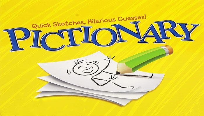
One of the few party games I like is Pictionary. I’ve written briefly about it here (Pictionary presentation thinking) but the idea stands to be briefly revisited here. If you can get something as abstract as the concept of “Bear with a sore head” over in just a couple of minutes sketching you can get your mind into the idea of explaining things quickly, easily, simply and in an engaging way. Stop thinking that your presentation is serious and just start designing it like it’s you’re playing a children’s game!
Another way of thinking about this is to imagine you’re writing a newspaper headline instead of a slide. While I don’t read the Daily Mail (I have some self respect! 😉 ) the headlines there are generally a good role-model (style-wise only! 😉 )
Better presentations – presenting for children
It’s dawned on me as I’ve written this that the thing all of this has got in common – presenting like a teacher, being a children’s TV presenter and so on – has one thing in common… children. I’m not saying you should treat your audiences like children but… oh what the hell, yes I am! 😉
