
When we talk about an image being ‘isolated’ we mean that the main object of the image isn’t cluttered  up by a messy background – usually there’s no background at all. The image of the girl to the right is isolated. If you want to show someone bored, there’s a good chance that this image, or something like it, will work nicely on your slide. Compare it to the ‘capture the moment image of me, making a presentation, below.

You can see immediately how much cleaner and classier the girl image is than the one of me – it’s not just the subject, honest! 🙂
So why is it a good idea for your presentation?
It’s not just a matter of being classy – though it’s certainly that – it’s to do with the audience’s ability to concentrate on what you want them to concentrate on. When they look at me, they’ve got to mentally filter out the flipchart, the curtains and so on (and even the slide, probably) to be left only with me. In the picture of the girl, all the audience’s brain-space is available to focus on the important content.
And it’s not just one slide, either – I’ve noticed that the effects can be cumulative. Slide after messy slide builds up a sense of confusion and, dare I say it, even a little fussy distrust of the content of the presentation. The less it looks like you’re on top of your game, the less your audience is inclined to trust your content.
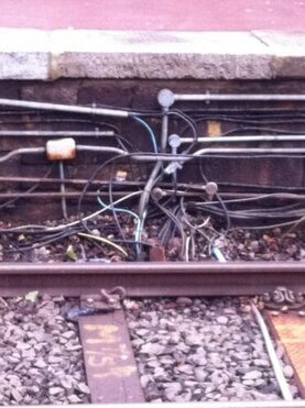 Here’s a crude example/analogy taken from the Metro system near where I live. As far as I know there have been no fatalities on the system, ever, but as I rush along the tracks, I don’t want to think about all the very complicated systems involved and how often an opportunity for mistakes present themselves. And the very last thing I want to see is the unholy mess of cables and junction exposed to me at my local station
I’m sure it’s safe, it just just doesn’t present a good, safe feeling, when I see it.
On the purely aesthetic level too, take a look at the slide below, taken from a presentation I was working about about seven years ago now… I can do some reasonable integration of the image because much of it happens against a black background, but the colour of the dance floor stands out and looks ugly as hell.

Fortunately, with just a tiny bit of magic in Keynote (my presentation software of choice) using the ‘Instant Alpha’ function, I can cut out a lot of the messy bits of the slide.
The result is that the whole thing has something of a more classy feel about it. This is only the presentation’s splash slide of course (the one you have showing as people come in etc) but I’m sure you get the idea for when you apply this approach to the rest of the slides in your presentation.
 … which is now a classy work of art!
Oh, by the way, ignore the small white dots in the middle of both slides – that doesn’t happen in the presentation – it’s there because I did a screen grab of the slide and I’m too lazy to edit it out!
And how do you isolate messy images?
First things first, if you can buy image, buy them isolated. It’s that simple. Your presentation might cost a few dollars but it’s worth it. When you search for whatever you’re looking for just try adding phrases like “isolated” or “isolated on white”. You’ll probably get fewer hits but it’s worth trying. Actually, I lie, you don’t always have to buy it – there are some free places too. This blog has a list of 25 good ‘uns!
Not enough?
Okay, here’s a bit of free magic, curtesy of the internet: https://www.remove.bg. Remove.bg takes away back grounds from ages. Don’t ask me how I have no idea. By way of an example, here’s a before and after of me in the library.
[one_half]Before..
…and after …

I have no idea how it works. All I can tell you is that it somehow recognises people. When I tried to strip the background away from a picture of an elephant for a presentation I was making about mistakes (the elephant in the room!) the software told me there was no face in the picture.
At least that implies that I’m better looking than an elephant, I suppose.
Hardcore editing the images for your presentation’s slides
Your last resort is the “instant alpha”, or “select by color” functions etc of a graphics package, to edit the pic. That can be hard work and you might find it quicker and cheaper in the end if you just outsource it. It’s the perfect job for outsourcing in many ways as it’s easy to explain exactly what you want and it’s easy to know when you’re presented with a half-arsed job!
 For what it’s worth though, my editor of choice is Pixelmator. Even the pro version is cheap and the standard version is an absolute steal!
Please, no more!
So please, no more crap images stuck pathetically on the side of your slides trying to make your presentation look less like death by bullet point. Have some damned self-respect and respect for your message (if not your audience!)

Brutally honest but extremely helpful!
Pingback:Online Course Slides
Nice article Simon. I see that you have mentioned a list of 25 websites to find free images. I have another resource I wanted to share, please check it out https://www.stockphotosecrets.com/best-free-stock-photo-sites
I’m sure you would love it